Week 3
As an example of early experimentation of typefaces/font. I chose to look at 'The quiet noisy book'- Margaret Wise-Brown & Leonard Wisegard.
This book was published in 1950. After the second world war colour was starting to come back into everyday life more and more, picture books included.


The colours are very flat matt and the images very simple this is very typical for books of this time. The paper quality also was not particularly great so this added to the feel of the book.
The pop art culture that was occurring at the time has had an influence on the way the illustrations are made. Screen printing was a popular method with Roy Lichenstein and Andy Warhol.

The type was used in a variety of ways to accentuate the image it is supporting such as the word 'Noisy' is very bold and loud in colour (yellow). The type shows a more modern style than books of their time. Integrating text and image was something that didn't occur in books.
The scarecrow book from 1925- Theo Van Doesburg and Kurt Schwitters has been used very differently for the time it was produced. using type as the images throughout. This had never been done before.

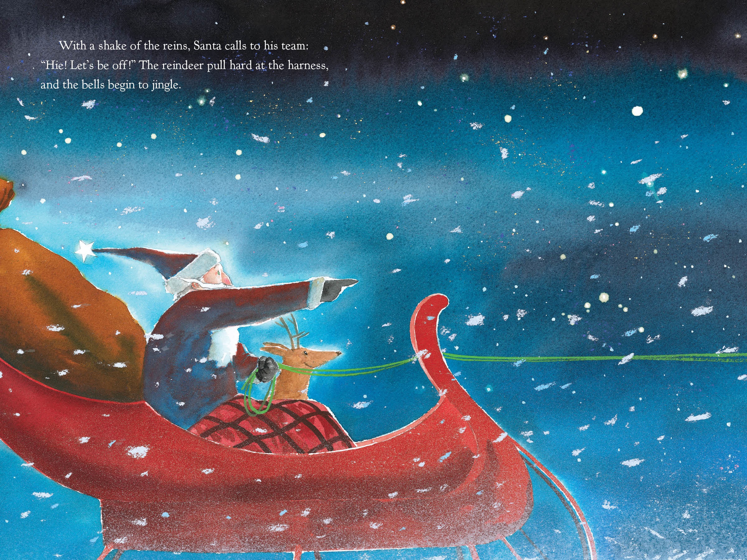

The images of picture books need to work well with the text not fighting with it. It has to be readable not too crammed in. Remembering that there is a gutter and to take that into consideration when designing it. Maybe using type as movement to add something to the images to make them less static, fun for example Lauren Child.
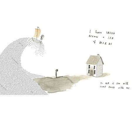
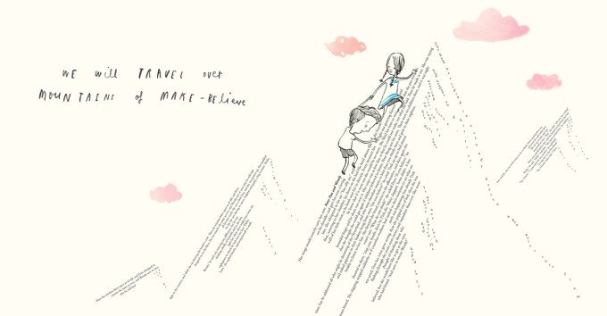
A Child of books by Oliver Jeffers and Sam Winston produced (fine artist) this beautiful adventurous book.

Things to consider when designing any book.
How old are audience?
How much text? Legibility of font.
What mood, tone or style?
Ref and information books where is the visual hierarchy, where does it start?
Consider the information you wish to display and does it need images/ diagrams to help.
This book was published in 1950. After the second world war colour was starting to come back into everyday life more and more, picture books included.


The colours are very flat matt and the images very simple this is very typical for books of this time. The paper quality also was not particularly great so this added to the feel of the book.
The pop art culture that was occurring at the time has had an influence on the way the illustrations are made. Screen printing was a popular method with Roy Lichenstein and Andy Warhol.

The type was used in a variety of ways to accentuate the image it is supporting such as the word 'Noisy' is very bold and loud in colour (yellow). The type shows a more modern style than books of their time. Integrating text and image was something that didn't occur in books.
The scarecrow book from 1925- Theo Van Doesburg and Kurt Schwitters has been used very differently for the time it was produced. using type as the images throughout. This had never been done before.
I chose to look at Lauren Thompson's book 'The Christmas Magic" Produced in 2009 with illustrator Jon J Muth. I love the soft watercolours that create the subtle images. There seems to be a mix of ink and watercolour used either sparingly or with much more contrast for outside spaces.
The text has been kept minimal and a simple type has been used. It has been carefully placed to allow space for the reader to absorb the words and image together. On occasion the text colour has been reversed to white making it stand forward to greet the reader.
The illustrator has created the compositions in mind to make space for the type.


The next book 'The forgiveness garden' is by the same author, but has used a different illustrator for this book. Christy Hale has produced a beautiful set of images to accompany the narrative using found materials and collage. Her compostion choices work really well for the images and this is a book i would love to own!

The images of picture books need to work well with the text not fighting with it. It has to be readable not too crammed in. Remembering that there is a gutter and to take that into consideration when designing it. Maybe using type as movement to add something to the images to make them less static, fun for example Lauren Child.
A Child of books by Oliver Jeffers and Sam Winston produced (fine artist) this beautiful adventurous book.


Things to consider when designing any book.
How old are audience?
How much text? Legibility of font.
What mood, tone or style?
Ref and information books where is the visual hierarchy, where does it start?
Consider the information you wish to display and does it need images/ diagrams to help.


Comments
Post a Comment